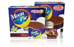
New Packaging Rockets MoonPie Sales
- Published: April 10, 2012
CHATTANOOGA, TN | In 1917 Earl Mitchell Sr., founder of Chattanooga Bakery, saw a need for a between-meal snack for local coal miners, and inspired by bakery employees who made their own open-face marshmallow sandwiches, added another graham-cracker and the MoonPie was born. Over the years, it became part of country lore, and in 1951, Bill Lister sang its praises in his song “RC Cola and MoonPie.”
Recently, during Tory Johnston’s 12 years as Chattanooga Bakery's VP of marketing, MoonPie continued to enjoy strong sales growth—even during the recession. “MoonPie is a comfort food and a trusted brand that people grew up with and look to fondly,” he says.
However, even with MoonPie selling strongly, Johnston saw an opportunity for growth by revitalizing the packaging. To do so, he commissioned The Goldstein Group, which specializes in the rebranding of iconic American heritage brands, to update the look of their best-selling product—MoonPie Minis and regular-size MoonPie—by emphasizing the brand’s authentic Americana image.
For much of the brand’s nearly 100-year history, MoonPies were wrapped in white packages printed with a blue-and-yellow logo. But MoonPie’s color combination wasn’t proprietary, and in fact, had become generic having been pre-empted by similar blue and white variations rampant throughout the snack packaging category.
Color is Key – New MoonPie Blue
 To differentiate the brand, The Goldstein Group redesigned the MoonPie packaging using a darker shade of blue than the competition and incorporated light blue swirls to enhance the depth of the graphics and represent the fluffy texture of marshmallow. The addition of a field of white stars completes the new night-sky ambiance. “We love how the new packaging celebrates the night sky, playing up the ‘moon’ aspect of MoonPie, and transforms white, our key brand equity color, into a fluffy cloud,” says Johnston.
Similarly, changes to the logo enhance MoonPie's cosmic emphasis and complete the new look. Under Goldstein’s direction, product imagery has been rendered more realistically, which represents a strong departure from previous depictions of MoonPie sandwiches on the packages.
“The new beauty shot is probably the single element we are most concerned with,” says Johnston. “We’ve always focused on making the product photo literal, true to life, but The Goldstein Group insisted that merely showing the consumer what’s inside the package wasn’t enough."
Terri Goldstein, founder and principal of The Goldstein Group, insisted that the image has to convey the texture of the MoonPie graham cookies and light marshmallow filling, suggesting the use of high-end digital illustration in place of photography for the hero shot. “Digital rendering captures the highlights and appetite appeal better than photography,” she says Terri Goldstein. The final illustration, says Johnston, “has unbelievable taste appeal and, along with other elements of the brand’s new trade-dress, can be copyrighted."
The new MoonPie design is printed by Southern Champion Tray, Chattanooga, TN, on 80-gauge metallized polypropylene film for the twin-pack wrappers. The film was supplied by The Robinette Co., Bristol, TN, with McCowat-Mercer Packaging, Jackson, TN, a secondary carton supplier. As an iconic American brand, we use only American packaging vendors,” says Johnston, "and we've been pleased with our vendors’ costs, quality, and service."
A Lunar Update
The new brand mark plays up Moon Pie’s heritage while maintaining a sense of whimsical indulgence. The descriptor—“since 1917”—was given a fun, wavy type treatment to enhance its badge-star status and moonlight stars, which reinforce the "ping" star added to the “M” in the upper left corner of the brand mark and a star above the “i” in Pie.
Each size has a distinctive call-out in high-contrast ref type. The “Original” callout has a nostalgic feel with elegant script and a playful star. The Minis lettering is tracked tightly to reinforce the idea of small and compact, while the brawny shape of DoubleDecker’s bulging type and red outline conveys the idea of two layers of gooey goodness in each snack.
The rich new color palette distinguishes itself from MoonPie’s competitors while reinforcing the MoonPie brand with its night sky imagery. The digital renderings of MoonPie’s sandwiches better convey the taste appeal and texture of the snack’s rich chocolate coating, delicate graham cookies, and creamy marshmallow filling.
The original design was set up to print in two other MoonPie sizes. The new packaging will reach store early in the second quarter.


